Plotly is an open-source, interactive, and browser-based charting library for Python. Python users can use Plotly to generate different types of charts including scientific charts, 3D graphs, statistical charts, financial charts, etc. In this tutorial, we...
Plotly is an open-source, interactive, and browser-based charting library for Python. Python users can use Plotly to generate different types of charts including scientific charts, 3D graphs, statistical charts, financial charts, etc.
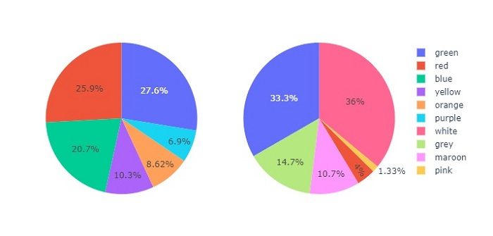
In this tutorial, we will show how you can use Plotly to plot pie charts as subplots with custom size.
Here, we will use the plotly.offline module to generate an offline plot.
We will use the plotly.graph_objects module to generate figures. It contains a lot of method to generate charts.
To create subplots, we will use the make_subplots() method.
Follow the steps given below to plot pie charts as subplots.
Step 1
Import the plotly.offline module to generate offline plot.
from plotly.offline import plot
Step 2
Import the plotly.graphs_objs module and alias as go.
import plotly.graphs_objs as go
Step 3
Use the make_subplots() method to generate "rows" and "cols" with the plot type as "pie".
fig = make_subplots(
   rows=1, cols=2,
   specs=[[
      {"type": "pie"},
      {"type": "pie"}
   ]]
)
Step 4
Use the add_trace() method to set traces for the Pie charts with the following values −
# Set traces for the first pie chart
fig.add_trace(go.Pie(
   values=[16, 15, 12, 6, 5, 4, 42],
   labels=["green", "red", "blue", "yellow", "orange", "purple"],
   domain=dict(x=[0, 0.5]),
   name="colors1"),
   row=1, col=1
)

# Traces for the second pie chart
fig.add_trace(go.Pie(
   values=[27, 11, 25, 8, 1, 3, 25],
   labels=["white", "grey", "green", "maroon", "pink","red" ],

   domain=dict(x=[0.5, 1.0]),
   name="colors2"),
   row=1, col=2
)
Here is the complete code to show pie charts as subplots with custom size −
Similarly, you can try creating different types of graphs as images.
It will show the following output on the browser −